
Lighting design has been around for a time, and a lighting designer takes home a Tony each year—presented off-camera, before the big event. Critics mention it only occasionally, and rarely with understanding. Maybe that’s because audiences, critics, and award voters don’t fully understand lighting. So we thought we’d try to illuminate it.
The Play—and Collaborators—are the Thing
Christopher Akerlind believes that when a spectator thinks about the lighting, there’s probably a problem in the show. “I like thinking that I’m working surreptitiously to enhance the human drama. Lighting design allows a story to happen as opposed to being the story,” he says. When Akerlind goes to the theater, if he feels the set and lights tell him too much, he wonders why he should stay for the rest of the show. He prefers simple gestures that are “compositional and enhance atmosphere as opposed to creating specific places.”
Bradley King adds, “Nobody goes in expecting great lighting but mediocre everything else. It’s evaluated as part of the collaborative pie, and when it’s working best, all the choices should be inevitable. Of course, the light should be that color because that’s what the set was, that’s what the sound was…The DNA of The Great Comet was so deeply integrated across all departments, so it was hard to tell where the set stopped and the lights began. That was the result of baking together in that same dish for five years.” (The first production opened five years before the show opened on Broadway.) His lighting for Natasha Pierre, and the Great Comet of 1812 earned multiple awards, including the 2017 Tony.
“What was so gleefully fun about Indecent was the empty space, an Elizabethan Our Town,” says Akerlind. “Lemml the Taylor becomes the stage manager, much like the Stage Manager in Our Town,” says Akerlind. “In Our Town, there’s a conscious disinclination to visually describe what the actors are telling, not to describe something that doesn’t need describing. I loved the production that came over from London with nothing, allowing my spectator imagination to go right into the core of what’s human.”
Ben Stanton says the design for Junk, for instance, “is so cohesive, you can’t tell what’s video or lighting. The scenery, which is brilliant, by John Lee Beatty, is a blank canvas. It does everything it needs to do to allow costumes, lighting, video, and sound to wash over it and make 40 scenes and different theatrical moments.” He says that he and video designer Ben Pearcy challenged each other to make it impossible for audiences to tell what each of them did. “We were both working to create a layered effect,” he adds.
Stanton often works with Lucy MacKinnon, “a video designer who I happened to be married to. The Off-Broadway play, Yen, mostly took place in a single room. Because of the way the set worked, I didn’t have a lot of places to put lights. There’s a big window on one part of the stage.” The solution? The video design provided the front light the production needed. “It looked like I was doing a lot more than I was doing. Video is a more complicated and sophisticated form of lighting design.”
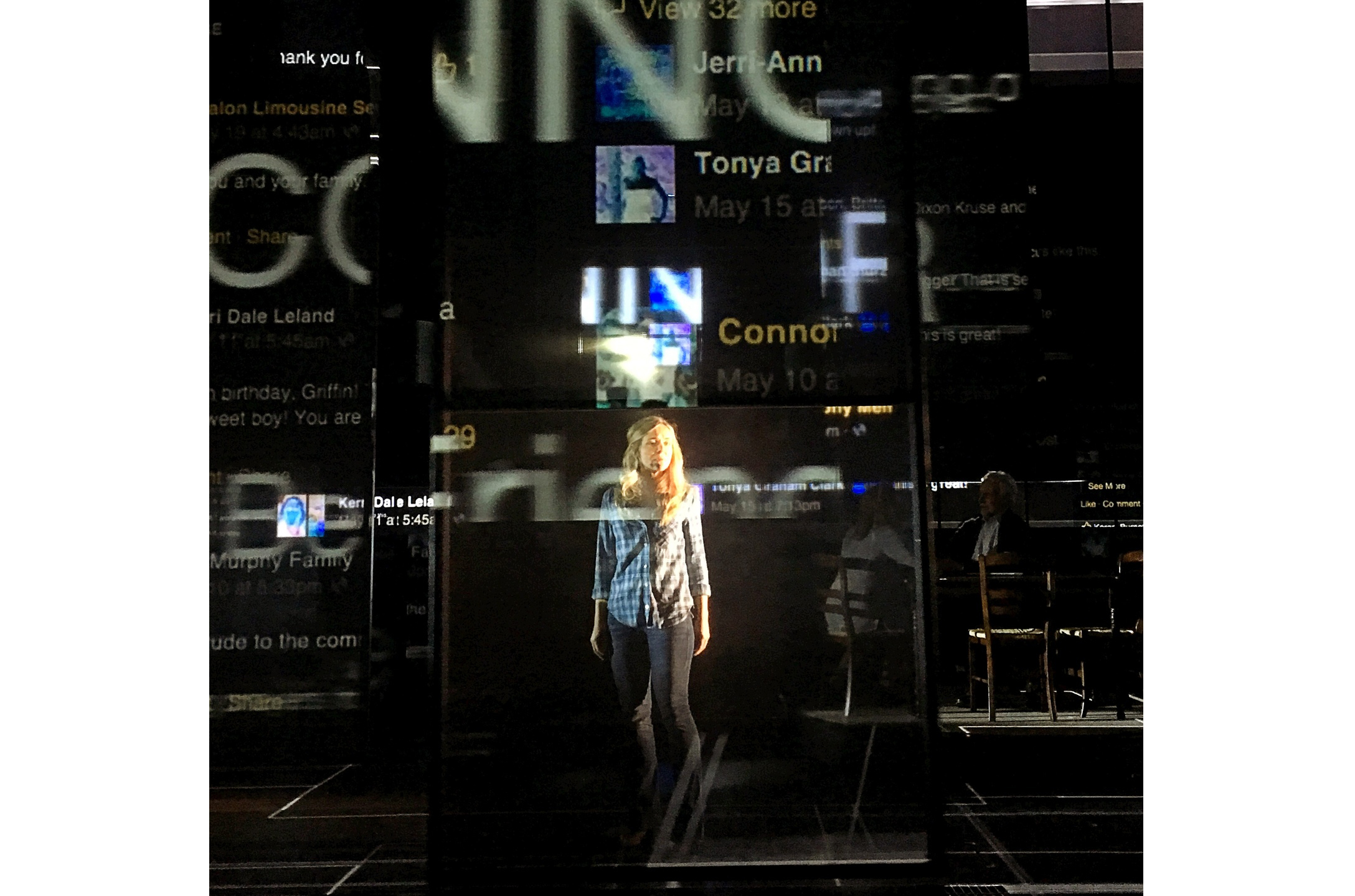
For Dear Evan Hansen, "the set designer [David Korins] understood you need a good lighting and video design to achieve the requirements of the story and created a set with multiple video screens and scrim surfaces," says Japhy Weideman. “More and more, the shows I do consist of minimal scenery such as a floor and back wall and the other many environments/locations all happen through lighting and meticulously structured cues that carve out space,” he says, adding that clothes and actors are incredibly important to the sculpting process and that the video design work occurs in tandem. “At times, he’ll [Peter Nigrini] have images that are all blue and green, and that tells me where I can go. I’ll turn on a strong black light behind it to give his image a four-dimensionality,” he says, noting that he needs an angle of light that hits the actor and ties him together with the video. “I don’t know exactly what the design is going to be until we make discoveries through the process.” Moving lights are essential so he can change angles and positions quickly, on the fly.
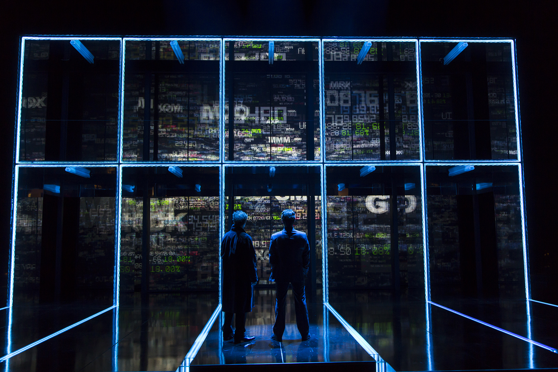
Justin Townsend says he and video designer Finn Ross created a unique vocabulary for American Psycho. “Conventional lighting ideas wouldn’t work in that white box. It was exciting to engage the problem of how to light it in a new way,” he says. Working with David Zinn on The Humans, “we created almost a ghost story so the end was inevitable and it made sense all the lights would go out. The shadows and strange angles in the beginning of the play help the ending make sense. I’m excited by lighting moments where we have to recreate how to make the lights work and tell the story in a way that’s beautiful and appropriate.”
Collaboration can be wonderful or not so wonderful. During more than 30 years in the business, Akerlind has worked in a wide range of collaborative situations. Some directors leave him alone to do his thing, trusting him to deal with issues as they arise. Now, he sometimes works with young directors who don’t know him well and say, for instance, “turn that up ten percent” or “let’s make that a little brighter.” Akerlind states, “I can achieve the desired change, but in my own way. It doesn’t necessarily mean changing the foreground; it might mean changing the background. Rebecca Taishman is a very close friend. We talk about the play, and then she’s happy to arrive at the theater to see how I’ve built on our shared sense of it,” he says, adding that this building isn’t preconceived. “The thing I love about working in the theater is working in the moment,” he says, explaining that in some productions, things are done so far in advance, “you get to the theater and it seems old. In the theater, the outcomes can change every night, it’s never finished.”